Convey solidity before even describing the offer.
A building materials business needs to communicate trust and explain what it offers. For Fortivus, the identity also needed to work beyond paper: its commercial vehicle would be a public touchpoint.
The artwork had to respect doors, wheels and bodywork shapes, maintain unity across surfaces and highlight the cellular concrete block sold by the business. Brand, product, message and phone number needed to share the space clearly.
The industry's language becomes a visual identity.
A construction symbol
The geometric monogram explores connections, structure and progress. Horizontal and vertical configurations let the brand work in spaces with different proportions.
Color with a purpose
Dark blue anchors the composition. Orange creates focal points and separates sales information from supporting elements.
Product in the spotlight
The cellular concrete block illustration forms part of the message. The hierarchy guides the eye from product to message, brand and contact, respecting each vehicle surface.

An identity built to take up space.
Fortivus draws its visual language from construction itself: materials, connections, structure and progress. Every choice reinforces a technical, contemporary brand that remains approachable to buyers.
Meaningful geometry, beyond decoration.
The monogram combines planes reminiscent of beams, walls and interlocking modules. Depth gives the symbol substance; the upward design adds direction and growth.
Two logo configurations. One consistent presence.
The horizontal version suits wide spaces. The vertical version concentrates the brand when the format needs more height. Both keep recognizable contrast and hierarchy.


The brand stays strong when it starts moving.
The vehicle received more than a logo. It was treated as a business touchpoint: quick readability, visual continuity across surfaces and emphasis on the product being sold.
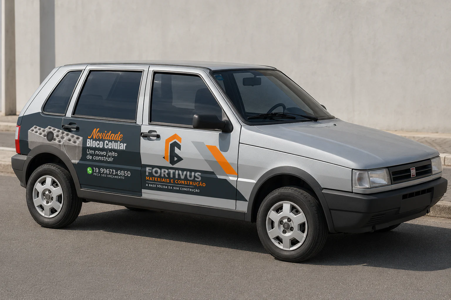
Visual presence also means organizing information.
Doors, wheels and bodywork shapes become guides for the composition rather than obstacles. The result preserves brand consistency without compromising each message's purpose.
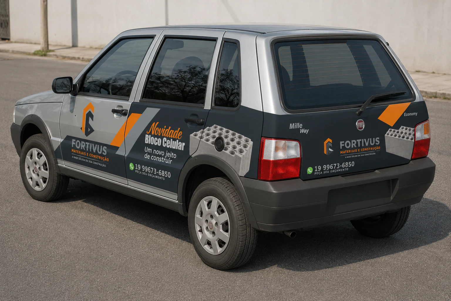
A brand that stays strong in every format.
The project brought concept, logo configurations and applications together in one visual direction. The system was designed to make Fortivus recognizable in a company presentation or on a vehicle seen briefly on the street.
- Visual identity with horizontal and vertical logo configurations
- Brand palette and visual direction
- Artwork for the sides and rear of the vehicle
- Presentation and approval mockups
Does your brand need the same clarity at every touchpoint?
Explore digital presence servicesProject by Lucas Bertosini · O Criartista · 2026